work

Saturday, 31 October 2009

VCT-reappropriation


VCT-cut and paste. This is all about re-using images for your own purpose, to manipulate an image to your own message.

Here i used a juxtaposition of an asda advert about cheaper meat prices with the image of a british soldier. 
What i wanted to communicate with the 'low prices' and the soldier is the current topic on funding for our armed forces.
The british army,money are a couple well publicised topics considering we are in recession and at war on two fronts for a good 8 years or so.
Also this is the season there is alot of publicity about buying poppies to show support. I feel the comment i am making about the armed forces being under paid is a valid one. they are; and from what ive read in the headlines its effecting peoples lives. which is why i added a sly [lives]£1 less. and the fact it was from a meat advert kinda says a bit more brutally how they are treated by those with the purse strings. 
bit deep n depressing but im pleased with myself for tapping into a current subject and producing something simple and effective. We had a bit of time for this so i kept adding bits to the arrow and other stuff so not to look like i was wasting time. i tried making another but it was crap.
i am to write 250 words on this before next week which i dont see as being too difficult.

am i waffling on a bit too much on these blogs?


Process [collage workshop]

my collages made in the workshop. Ill upload the homework ones when thyre ready

Process workshop!yeah i liked this one, im finding with all of these workshops thyre kinda streching my thought process and way i do/look at things. i wasnt really anticipating that

anyway this workshop was looking at manipulating images to convey a message, and we practiced this through the process of collage making. i loved this!i been planning on practicing and doing stuff with this area for a while n this has given me a bit of a kick up the arse and a chance to practice it. i hope i do some good ones the stuff ive seen that has inspired me is pretty decent. ..
'Jamie Reid'-he did some fantastic looking punky collages, most recognisable being the sex pistols album covers. i found an article on his work in a free magazine you find kicking around odd shops. ill be sure to upload some of that another time. also some of the stuff that inspires me i uploaded at the start shows at least one artist who uses collages for great effect as backgrounds [Obey/shepard fairey] and another who makes collages using photoshop [tes one]

anyway we are to make a 100 images exploring a variety of emotions. although hard work will be good fun


Typography workshop

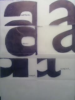
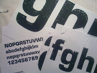
In this workshop we were introduced to the different elements of letters/fonts/typefaces and their applications. Looking at how a font is more relevant for conveying particular messages etc. also looking at details such as the differences and what is ligatures serifs etc. i quite enjoyed learning that bit....
as you can see in these images i went about visually exploring the differences in various fonts by focusing in on different elements such as the ligatures, serifs.
i ran out of time before finishing the above image but i didnt like it anyway


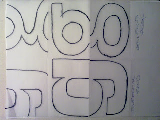
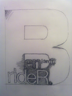
We started exploring type by being given a choice of 5 or 6 different fonts and to trace out our name. 
-Now this exersize on its own i actually quite enjoyed and opened up a lot of ideas; im a bit crap with computer programs and my mind can work things a lot easier when doing stuff hands on, even if it does take a bit longer. [jo's computer workshops have since improved this, particuly manipulating type in illustrator-more on that another time]
-i really like the quality given, particuly here; it being done in pencil and the fact i didnt get time to finish it completely. brilliant n visually interesting in my opinion

Overall i enjoyed this workshop, i see type as a serious fundamental of graphics and i look forward to getting my hands dirty with more knowledge on this subject.

about my blog posts

looking at my previous post im getting slightly disappointed at the layout, i wish i had more flecibility in planning the layout , how the text+images can go together, all i did with that last one was spam the space bar until i thought it was low enough for the typre not to be all squished up to the side.

also continuing from the previous content i look forward to putting up images of the end results from letterpress hopefully monday. the inks gta be dry by then
and any future experiments

if anyone discovers some mad trick or technique with letterpress please let me know!

letterpress round 2


Letterpress part two! I feel in this session i learnt and did the most. 
what you can see in the pictures are the final stages of the end result. I worked in a team of 4 others and i reckon we all got something out of the end result i feel we are all happy with the design we agreed on.
i still like an idea i had right early on and might sly back in there n do it; we were given a brief to use words to describe the colour red. we used the expression "bloody hell!" as both words relate to the colour and its emotion is definately angry all communicating something about the colour. [my idea was to have Danger! with the middle d'anger'! letters in red.

you can see here the paste up we made, through to piecing it together and securing it to the final adding ink to the machine. note its best to dab the ink on to give a blend and let the machine do its thing for a bit to get a wider fade.

i loved it all, and i was particuly deligthed with a cheeky experiment of launching a spattering of white spirit onto the inked up letters so that when it printed gave a mad spotted effect, really visually interesting. one of the others did it a bit better i felt n made the 'bloody' look as if something has actually been bleeding across it. good work.

final thoughts; Letterpress is a fantastic resourse and i feel lucky to have access to it. David and Alex have been very freindly and helpful. The subject has made me adress layout in a much more serious way and has made me think much more about stuff like bleed etc
this introduction althouhg has taught me alot and has opened up a door of possiblities making me think of all the possibilitie i could eek out of this hand made process, but has also taught me its a very deep and precise art to do well and would require as much concentration as time to execute correctly. Having said that im a cheeky fan of imperfections and not doing things how your supposed to, so having got the inside track into how your supposed to do it i know im going to have great fun breaking them rules and seeing what visual madness i can manipulate.
for those into type, printmaking or even graphics in general id highly recommend it.

Saturday, 17 October 2009

Letterpress


letterpress stuff!

as a start we needed to compose our names using actual lumps of text. Baskerville i think is the font we used. 
turns out its a right pain in the arse if you dont take your time as i dropped loads of letters id spent ages putting together.the bastards.


yes its a little tricky but i relaly enjoy this hands on approach. i think im going to take a lot from this.

we have a small brief to make a composition using type communicating something dealing with colour.
we were given the colour red and set about thinking about things assotiated with it. i was delighted with a suggestion i put forward.hopefully show it another time


week 2

this week, looking back actually has been fantastic; everyday something new, something interesting,colourful, different. just the variety! im really enjoying being in college, being introduced to new ideas and ways of thinking. so far ive got up everyday looking forward to what it brings
brilliant
i get the feeling this course is really going to test me, and im a bit anxious about the upcoming 4 week project.
this week i really enjoyed the typography we did tracing letters getting back to basics and thinking of typography in a different way.the little sketch i did of my name i think has a really good organic look. ill scan that later
and letterpress was really good, im just loving that im gna really enjoy spending time down there doing allsorts of stuff. its a bit mad holding the letters and actually spacing it n that by hand. bit like a medeival word processor
and fridays collaga stuff was great!even though we need to make our callages in a particular way its definately opened doors of ideas for me.

the only thing i find ive been struggling with a bit is the vct classes.im not sure i have enough to offer and sometimes feel as if its a bit too deep for me, too broad ranging.but im confident over time everything will fit into place.

but in a nutshell; delighted with everything im doing and learning and the people im doing it with


Monday, 12 October 2009


bollocks.
cant post videos
http://www.youtube.com/watch?v=CPd906atjvU


the prodigy! inspiration in itself, but the recent albums/poster designs are great. that edgy punk kinda style reflecting the bands music is great. and the choice of like one main colour. jus visually pleasing to me


Sunday, 11 October 2009

book covers by the same artist/designer as below. perfect for the content of these books. so dark looking.great illustration and style.excellent


this is work by 'shepard fairy'. im interested in the way alot of his work is screenprinted, uses different layers and textures and just the whole way its been excecuted having this propaganda style. these examples arent the best as i just did a cheeky google images on what i could find but loads more on 'obey.com'


the below images are by 'futura'. did the cd covers etc for 'unkle'
to me it just looks great, fantastic style and colour.
really creative, and another example of merging hand drawn skills into design


Im going to upload some images i like and find inspiring from some different artists and designers.

These images are by an artist named 'Mode 2'. his art is just fantastic, incredibly well drawn and stylised characters, just a brilliant contempary artist.  
what i find inspiring is the way he has taken his art into graphic design and created some incredibly colourful and interesting projects.

that and what i feel is a really fusion of  hand drawn stuff and computer programs.
love it

Thursday, 8 October 2009


I had to post some images of graphics found in the shopping center accross the way from college. 
-brilliant arent they, jus love the way thyre seem really dated. -dont want to say more than that here to be honest.
im finding it hard to put into words why these interest me so much, thyre so old and unique. as if a kind of graphic window into the past, like when you see them old victorian/pre-war shop signs painted onto the walls of odd buildings.


Pictures i took this week


this mad stuff is an art installation just down the road from college. [Harper Road-open until they knock the buildong down]

Its called 'seizure' by Roger Hiorns. 
basicly what it is; theres a few condemned buildings around the area and this small complex of flats holds the instillaton. The artist opened up one flat and flooded part of it.

he used some kind of strange chemical which chrystallised into this fantastic blue-purple chrystals.

Its brilliant and i think really shows the potential to what else can be done with a space other than knocking it down. it adds colour and interest to something 'condemned' as ugly and useless.
-i would really like to see many more projects such as this, especially with these knackered old buildings; why not hand over a portion to a group of artists or students to create something completely unique and revitalise an area. 
only good things can come of this
[and its free!]

Wednesday, 7 October 2009


Good it looks like ive finally done a successful blog

this is all new to me so i aim for this to all be a lot more interesting and colourful as i warm to the idea more.

-These 3 images are my answers to the summer project brief; to graphic design up a piece of advice of your choice about the course.

I really quite like these. I dont want to waffle on so ill just say going on the feedback i got i think using colour would definately have been of some benefit.

-also the fact i did these as landscape-not portrait and therefore failed the brief. Im happy about failing this because right early on has given me a kick up the arse about how much attention to detail i really should be committing. and rightly so