work

Thursday, 29 April 2010

Workshop.6-Stencils+ Metamorphosis.

this was a great workshop!-im really into process,getting my hands dirty. its the fact i can actually hold and have complete control over whats happeneing-yet at the same time you cant be 100% about exactly how it will look-it always looks better than you imagine in my opinion, but because you can see and physically hold each element involved,each tool-i understand it better and my mind works with it better. this is why im more tuned into a hands on approach to image making.

i also really like rachels way of thinking when it comes to this-having that element of slightly rough and ready and clearly hand made-that slight imperfection actually works to the images benefit! below is one of the final images i made
-the brief was,using cut outs to make a stencil dealing with london-either a word or a letter of london that makes a play of the theme of london.
originally i started to sketch the letter L with a city scape-but i hated it. and i started to think more into this idea of characters of london and was talkign to rachel about it and with the previous karls workshop thinking of london as different things i wanted to start with animals.


I began by finding a profile image of a default pidgeon-i felt that was this animal is the biggest londoner of them all. I photocopied a £5 note and reversed the queens head and basicly stuck it on top. 
i noticed how the curve of the queens neck into shoulder blended perfectly with the curve of the pidgeons back to neck to it morphed really successfully!


we were given a couple sheets of plastic to cut the stencil-plastic as we wer to use water based paint and sponge rollers [never used these rollers!turns out thyre great!-look at the quality of the mark i was able to achieve so easily, kind of rough and bubbly and textured]

we were given just two colours to work with-red and blue.i like this. it ties into what i was looking at with Jo's workshop. i feel this deliberae self imposedrestriction actually frees up my creativity!


afterwards alot of people asked me how i was able to make the stencil so life like, if i used photoshop to posterise etc, i did try that but i didnt like it, i simply traced round the shadows i wanted in and felt relevant so i could have more of a say into how the image looked and its style, filled in the shadow with black pen then just cut away!


the stencils. as it was to be two layer [which i was thankful for] i simply made a hole the shape of the outline of the detail image and then cut the detail stencil to go on top


Rachel [thankfully] encouraged me to create many different prints! so i started with a raneg of different backgrounds, mixing the colours, using heavy pressure on the roller and light pressure, only partly filling it etc


then i just added the detail stencil on top and each print was an utter pleasure to do!


i think its quite funny! im really pleased a sense of playfulness comes through. there are more levels to it though which i am happy about, i am looking at and interpreting london in my own way and i like how as you see the queens face alot, you also see pidgeons


So im dead keen on working with this london animals theme

as i mentioned before from darrens workshop im being drawn down this path of creating a series of characters of london.it could be characters on

-THE TYPES OF PEOPLE AND PERSONALITIES WE FIND HERE- such as a punk/chav, office worker,mother and pram, cockney,etc etc 

-STEREOTYPICAL LONDON PEOPLE AS ANIMALS OF LONDON-like the pidgeon queen, i feel the FOX,MOUSE,RAT,PIDGEON,HEDGEHOG,CAT/DOG are very london animals, the old fashioned 'bobby' policman as the fox or dog, the furry helmeted soldier guard as hedghog etc etc 

these kinds of things

also
-following on from rachels london monoprints to create a series of images of london, some etchings and/or woodcuts of the bankside/scenes of london-this would be very good id like to produce a series from each process available to me, 

-this would tie into jo's workshop as well which in itself im going to have a world of messy fun with. ive been taking digital photographs [which has been quite alien to me leaving my 35mm and double exposures at home] with the aim of creating a digital montage to then screenprint in only two colours.
but also mixing some of that in with rachels workshops.

-id like to do some kind of type-possibly made from the rubbings ive been taking, mixing them digitally which would work with the self initiated hevetica distortion ive mentioned before, introducing hand made/digital imagery into the mix

ooh this is going to be a bloody fun project!!!!!im litrally rubbing my hands with excitement for the possibilities -NOT MUCH TIME THOUGH!!!!!
Wednesday, 28 April 2010

Workshop.5 Communication & Texture with Karl Foster

-really good, all about thinking and looking at london in different ways.
this really contributed to my earlier thoughts on characterising london, making london into characters, characters of the people, animals etc. and rachels workshop later on helped even further. i really feel i want to pursue this idea and see where it leads

-its also very interesting to note something karl said about this book project overall-TO REALLY INVESTIGATE, TO REALLY DIG DOWN INTO SUBJECT/ WHAT YOU WANT TO PURSUE. JUST REALLY BLOODY GET INTO IT, RESEARCH,PURSUE, INVESTIGATE. TO GO FURTHER INTO!!!!!!!!!!!!!!


NON VISUAL LONDON- smells,sounds,taste[fish+chips, pollution], atmosphere/vibe

NON AURAL LONDON -what you see,feel,remember

NON VERBAL-busy,crowded, systems at work [directions etc], behaviour-the way people use a city

-THERE IS SOMETHING DIFFERENT THAT MAKES A PLACE INDIVIDUAL-what is it?

LONDON AS TIME-history,architecture,fashion,rush hour

AS SOUND-building work, traffic,planes,weather[rain],accents,language

AS WORDS, typefaces, adverts,

AS SPACE -open and closed, mixed, industrial.residential.shopping.office

AS SMELL-urinal smell underpass,thames,fish market


i thought this was interesting, what kind of person would london be?what kind of personality?


we then made a collage to represent one of the character traits.-i wanted to represent london as open minded,busy and the sheer variety!


Tuesday, 27 April 2010

A.P.F.E.L.-design studio visit


This was a very positive experience. Their work was interesting but what i took most was confirmation of a few things i had been hoping about regarding employment and real world work. it was also brilliant to see a working design studio and added a few more logs to fuel my fire for working in this field in the future.

we spoke to the two founders of the studio, and where really nice, down to earth people. i walked away feeling more confident about my future, confirmed where i should put my time and eager to do it. im going to list what i learnt below...


i asked a few questions and was very happy with their answers. just what i was hoping for.

-NEVER BE PADESTRIAN, NEVER BE NORMAL!!!!NEVER BE BORING, STICK TO WHAT YOU LOVE, WHAT YOU KNOW, WHAT YOU DO BEST. but still display in your portfolio as wide a range of skills as possible. i was concerned taht my lack of webdesign skills would hold me back, not so much so. GO WITH WHAT YOU ARE MOST PASSIONATE ABOUT!!!!!!!!!

-i was also pleased to see hand made imagery playing a part in some design

-also how in the real world research really does play an important role.

-REALLY DO SELF INITIATED STUDY!!!JUST FUCKING GET IT DONE!!!make time for it, do it!!! it really works in your portfolio. thats definately given me more than enough to decide where to put my time

-NETWORK [get jobs,contacts] EXPOSURE, -KEEP BUSY!!!!!!!!!!!!!!!!!!!!!!!!!!

-again, KEEP BUSY!!!!SELF INITIATED!!!!

-WEBSITE PRESENCE IS IMPORTANT!!!!!!IT HELPS [check out www.krop.com]

-CONSIDER WHO, WHAT WHERE TO WORK WITH AND ON WHAT

-be inspired by the found, whats around you.

-and its true SEND A PDF!!!AND PESTER THE FUCK OUT OF THEM IF THEY DONT GET BACK TO YOU KEEP WRITING KEEP SENDING YOUR PDF!!!!!BE SPECIFIC WHY YOU WANT TO WORK THERE


Pick Me Up exhibition-somerset house


This was a very inspiring exhibition, what i felt was seeing the results of much more artistic or experimental design, and process driven design. not only was there a heavy screenprint influence but also what was originally a chinese process of basicly cutting out patterns in paper-rediculously time consuming and the idea of carrying out this process-especially to their level of detail and SIZE-and the planning that would require so  it all joins up!-that would just drive me insane.

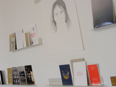
one other thing was alot of self made mini books and comics and things-i really liked these as im VERY keen on doing a few myself with different processes. Im going to make a special post about this soon as one of my freindly graphic design freinds took some shots on a fancy digital camera for me ive yet ot get my hands on


the reason i liked this was seeing how and what could be done within the restriction of just two colours. somiething i really enjoyed in jo's contrast workshop.


this was the insanely time consuming process. i liked this particular one as they mixed it with some screenprinted text before cutting out.
-see how it all joins up.that would just simply drive me mad.expecially if you broke one of the joins!


wicked little calender i found!definately hand made process, i love things hand made, a little rough and ready and each one personal.im all over that and want to produce similar-but the important question is do other people like this too?would it sell?


i just though this was a brilliant idea for adding just that little more excellence and brilliance to a screenprint edition-embossing your name


i think this is a brilliant character


LOVE THIS POSTER-im planning as a self initiated project to make a montage/collage on photoshop and produce a screenprint similar to this. but possibly contrasting london, or simply of london itself and what i found interesting. i rented a digital camera from photography
-thyre not all that great but only going for it as it should yeild bigger and better images than my camera phone!
im really considering investing ina decent one now-probably a solid pocket one ill always have rather than some massive one that looks more like it could take out a plane than take a picture


i enjoyed it.somerset house the place id say is def worth visiting,lots of other odds and ends to see there