work

Monday, 22 February 2010

What i found in college..


Its really just the top image that really inspires me. i thought that was executed brilliantly, and in a really interesting and unique approach-using some kind of small stamp-similar to them japanese ones you see, and using different colours.really well done

but i also like these patterns at the bottom, painting on paper and ripping it out. interesting approach i like it.

-luckily we had the opportunity today to do something very similar which ill make a seperate post for...

Friday, 19 February 2010

seLF INITIATED-[more] Double Exposures.2 black+white film


some of the better ones from the latest film
ive got litrally 100's from this year but these are the first ive scanned the negatives
the colour one was mostly crap images which is why i only took a few out.but they are pretty cool and i liked them. always interesting these things

Im planning on putting these altogether into a book.-this is what id like to do for the collage extension project. 
it originally started as some spreads i did for a project on the ABC graphic design diploma last year. the feedback from both teachers and students was great and turned out to be a very successful project, and ive been meaning to continue with it, do a stack more spreads and produce a finished polished book.

i emailed darren and he said to email the fda collage group thing. which sound slike it meets the brief then but ill email them guys anyway see what they say.my only concern was that this is collages made from photography not cut out paper and if that doesnt answer the brief is my only query.-i also wna do some other mad thing one day for this project using every possible process available in college for one image. but more on that another time


SELF INITIATED-[more] Double Exposures.1_colour film


i actually love the colour film on screen. these were scanned in directly from the negatives in th photography lab

lovely beutiful lush vivid colours.
and for these experiments i make a point of using cheap film!-my dad told me every single brand of film comes from only one of two factories that make it.there are only two factories that make film for cameras. so in the end the name you buy is litrally the name you buy. poundland does the job for me

altho i do spend when comes to black and white film.take much more care with that even if i am doing double exposures

Cool colages+mixed media [Mark Lazenby]


just browsing around and discovered this work!really like it, just seems really cool.contempory. the kind of thing id keep. i think they have been done really well, i llike the mix of what appears to be old text or parts from old papers or something, and love the mixes of different paper like you have the layout grid paper up at th top there
nice!excellent style shows what we can do with enough time patience and lots of cool magazines!

Thursday, 18 February 2010

Typography.1 [Type checklist!]

I thoroughly love workshops.

today we learnt more about typography.something ive been itching to learn and get to grips with. I feel very lucky i did a diploma in graphics last year and our teacher was a very solid typographer. i say this because the groups are quite large for these things. i guess nothing can be done about that other than push yourself. 
but the class was conducted excellently and i learnt alot more tips n tricks i didnt know before! and im starving for this kind of information and way of learning.

so this is what we did and what i learnt. im doing this for my own benefit to reflect on the day and remember it and also so i can come back to it in the future incase i forget something!

[also no pictures in this post ALL TYPE AND FASCINATING INFORMATION!]

TYPE CHECKLIST:

1- Typeface how light/dark you want it to appear. Massimo Vignelli said that a designer should only use Bodoni/Century/Futura/Garamond/Helvetica. You can do anything with these 'faces-all emotion can be captured.
It can be argued the use of a SANS SERIF for everything-the meaning and emotional response being conveyed using COMPOSITION, SIZE, COLOUR etc

2- Weight Bold, light etc. which works for the job?experiment

3- Size for a book a good size [point] 8-11

4- Leading space between lines.-rule of thumb-the longer the line=more leading

5- Line length/measure not too many words in a line otherwise it can be hard to read.THINK ABOUT EASE OF READABILITY. max-about 12[eg for a book] to a minimum of 8 [eg for a manual]

6- Alignment default range left [TURN HYPHENATION OFF!]

7- Letterspace think Kerning=space between each letter. is it too close?too far? "Universe" font is quite well spaced. CHANGE TO 'OPTICAL' from 'metric'. optical is the computer overiding the fonts set spacing [metric-how the designer did it] to optical to it works for your work/on the screen.-makes it more even

8- Wordspace think Tracking.play with both see what works. 'JUSTIFICATION' try about 80% [from 100%]. does it look too tight?too spaced? tightening wordspace is good

9-Hyphenation sort it out[as above and also.....] if using the instant thing where its all blocks of text with last line ranged left put the hyphenation back on

10- Line endings/turnovers didnt touch upon this as its just an anal level of attention to detail.balls to it

11- Hanging punctuation/ "STORY" WINDOW=TYPE+TABLES=STORY click it on. this is so the comma [ "] hangs just outside of the text box, so all the Text is aligned, not the characters. i like this.

12- Denoting Paragraphs when you use the tab bar to push the beginning of a paragraph in a squidge [indent]. used alot in publishing. do it properly-put the same value as the point size of type [or do multiples of this to look fancy.experiment can look quite good or contempoary-whatever works!:D] ALSO DONT FORGET AND DO-an extra 4PT for paragraph spacing. its up there in one of the little bars on the second indesign top toolbar thing.

13- Column depth how many lines in the body of text. about 40 is enough

and there you go!i enjoyed learning this. type to me is like the proper grit of graphic design.love to be able to spout endless opinions on fonts and their usage. learnt alot today and each sentance ive just wrote there is invaluable to me. will be reffering to this post and using these things alot methinks!
cooking with Photoshop...

Adobe Photoshop Cook from Lait Noir on Vimeo.


[practicing how to upload a video]

Wednesday, 17 February 2010

Justin Blyth-inspiration post


encountered this a while ago, and after my previous post I want to spend a bit of time diving into old and brand new work to whet my creative appetite as ive just rediscovered a new motivation after yesterdays workshop.and the idea of that self initiated project.

I cant remember how i discovered this but i was drawn by the calender images. fantastic brilliant illustrations.LOVE IT! the use of colour, the image.love it
and if u look closely past the fantastic use of just a handful of colours and the ace images themselves the calender is letterpressed!
and i like that red image with the text. want it

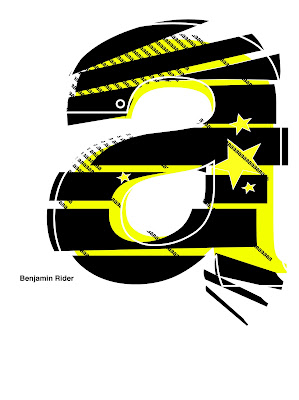
helvetica_experimenting with illustrator-jo's workshop1


LOVED IT!yes! love jo's worksop primarily as they really make me feel like im LEARNING. dont get me wrong im learning in everything i do here at LCC but with this, these computer based creative work is something ive always said i NEED and WANT to work on. i say it to myself so many times during the day. 
-I wouldnt say i lak the motivation to go and sit with my laptop and have a cheeky play, its just i dont know what i can get from it, and i dont know how to do it, and somethings i could do in seconds if it was physical seem impossible or long winded on the computer. 

But i love these workshops. thyre fun!Jo gave us a fun little brief yesterday, im quite chuffed i got the first letter of the alphabet to work on and i hope I did something interesting enough as a surface peice to the rest.
-brief was , given a letter, and using illustrator pesonalise it, distort it do what you want with it but keep it still looking helvetica. This was a great brief to dive into illustrator. I NEVER DO THIS ENOUGH!ILLUSTRATOR IS GREAT!theres something about it that feels really modern and designery about it. 

i really like this brief and im tempted with continuing the entire alphabet as a self initiated, only using computer tools to distort it how i like. This would be great to test out a bunch of styles and finally put to use what i been saying all year. to use the computer and understand it and even blend hand made images with digital. this is where i see my future. and once complete my look a beutiful page for a portfolio
PYCHED ON THIS LOVE IT MORE SOON!!

Monday, 8 February 2010

All ears week 4 final illustration [and development]


the top image is the final

i thought it would be a good idea to upload some of my development as this week i was using a computer to help create y illustration. im dead keen on some of the illustrations ive been looking at that have mixed beutifully a use of hand made things with computer programs. im generally quite hesitant about using a computer as im quite rusty and i think my two years in education should be spent pushing myself into using these things and bcoming familiar with them to add another weapon to my creative armoury.

for this week i again had 3 solid idea i anted to pursue and previous weeks have seen me do all three or end up mixing all three into one final. i was told quite clearly 'to do this idea and ignore the others' which is exactly what i needed to hear!

in my imagination i saw the final looking like somethign akin to a 50's era horror movie poster with the horrorfied woman being terrorized by,in this case, the two twins as irritating poisinous wasps. i think having them hold and point at the jam jars should have been more clear but im quite content with the final outcome.

i started by drawing each image and simply scanning it and using the levels in photoshop finishing them to a good standard. as i mentioned i am quite rusty on photoshop and took me an insultingly long time to get my head around just using layers to edit the composition. i was going into indesign and faffing about there which was a complete waste of time but i figured it eventually!

once i made a composition i was happy with i took another look and felt the image wasnt strong enough so took the drawings again and worked on them some more making them more defined

i re-made the same composition and took it into illustrator to make these kind of shock effects. i wanted to make each line by hand but had difficulty with the 'object-send to back' as the first image is white so they wouldnt show. this was quite frustrating as i easily could of printed it out and done the lot by hand

possibly made it look better too but i wanted to try it. in the end i made a black box and put a white star in it and tried out a few with different amount of points until i found something adequately dramatic.

as with all of these illustrations i want to revisit them and try out 3 or 4 different processes for each and see which works the best and maybe present these again. i like these and i like this project i enjoyed it and im keen to revisit them for my portfolio too.

Wednesday, 3 February 2010

Week 3 all ears roughs


this weeks roughs...

ive picked 3 of my favourites again this week, two in particular take my fancy and have differing approaches i feel work well.

The top image i envisage as almost slighty abstract-y, in the foreground you see an image of one of the twins and an exact copy of that image just behind her looking sideways at the distance where you can see the profile of a waitress. i feel this sums up alot of what happens in the text. the two twins glaring at the waitress holding a closed pot of jam. simple but effective i feel. i realy dont like the way ive drawn it here, it is a rough but id like ot use colour this week and i may even paint it

the second image down [and another variant of the same idea right at the bottom] is as if some kind of horror poster, as if 'attack of the complaining wasp twins' in the center you see a horrified waitres bein 'attacked' by the two twin wasps- even though there is no reference in the text i really strongly envisage these twins as being relatively quite old; with curly blue rinsed hair, brown cardigans, daily mail, that kind of thing. the waitrose reference and their attitude supports this for me. so i would want the wasps to have a human like quality they both have, such as a handbag [i feel drawing a waitrose carrier bag might enfringe on some kind of copyright law if this were being done for real] brown cardigan and blue rinsed curly hair on both of them also to show they are twins. I quite like this, i feel if i draw it properly it may work quite well screenprinted if i can which id quite like to do to all of my finals if i can before the assessment

the third image down from the top is a simple scene of the two twins as wasps. i feel this is an obvious image to choose as that reference in the text is screaming to be illustrated and i feel alot of people may have a similar idea. i will portray them eating jam, with bags by their 'feet' and the table overly laden with jam jars. in the distance id like to have some default profiles of waitresses, without expression to try and convey the twins' contempt towards them as if they arent even proper people theselves. this possibly forming a pattern to convey further that they encounter this in many places/all over the place.

i like all i feel they convey the text and i may continue with the style i used last week using fine pens and finding ways to incorporate colour. possibly screenprinted, possibly painted, possibly drawn onto coloured paper and cut out. out of the three im personally torn between the very top abstracty-ish one and the 50's-ish horror-ish poster-ish style.

Monday, 1 February 2010

All Ears week 3 final illustration


the top image is my final. I know what im going to be told when i say my scanner has been complete git all morning and last night and for some completely random reason scans everything in a diagonal rectangle instead of the entire image. but somehow after the millionth attempt i got a half reasonable one.well at least of the entire image. [for at least the 3rd time ive mention on this blog my heart truly truly, with a burning passion, truly hates hewlett packard]

the image- this week i tried a different tack with my drawing. -i spent a lot more time drawing and i forced myself to spend my time on exactly ONE drawing, and not spreading it out accross several half decent pictures.with this week in particular i had a few really solid ideas i really wanted to pursue and i think by forcing myself to do just one finished piece ive almost mixed in some of the other ideas. in the background you can see the or a stripper on a break reading a book on science/algebra hidden in a copy of heat magazine. in the foreground the stripper has a coin slot and a clockwork key to get her robotics working for her to dance.

personal reflection; i think i may have tried to do too much at once maybe, i feel the background image would of been a stronger finished piece in relation to the text, or possibly cropping down the image to the other strippers coin slot belly and clockwork key. i also feel the decision to do this drawing the the strippers upper half exposed may have been a bad choice as this is for the guardian and the editors may not appreciate that even if it is a drawing.

but this week im far happier with my finished piece than any ive done so far. i have said i ould re-do the previous one but with this i may keep it, and develop it further in the print studio with colour.

the reason why ive taken this approach and done it in black+white and in different sized drawing pens is becuase i want to try out a bunch of ways to draw and convey a personal style. Ie said before how im comfortable and enjoy using a gel pen for life drawing. this is a progression from that and a development using different sizes and i feel like ive discovered something new. also after the etching i really liked the quality of an ultra thin line and it is half inspired by that. yes i feel the image could use more polishing up and possibly cropping but i think it has alot of visual information form an interesting view of the text and is better executed than previous projects.
i think maybe this text just had alot more to work with?