What with the current job market,
what with fee's going up,
and cutbacks on so much of our education and daily lives
theres just a thing I want to remind you all for 2011....
what with fee's going up,
and cutbacks on so much of our education and daily lives
theres just a thing I want to remind you all for 2011....
 |
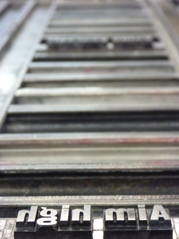
| This is part of the A-Z OF GRAPHIC DESIGN extention. I really wanted to develop a competent level of experience with letterpress. My first poster wasnt that great, but still cool. im not uploading any more images of it but was the same 'face with slightly less leading and it was silver on black. - With a week of open access I wanted to develop my letter press skills and I felt the original poster I made could of been so much better and try out a few things Ive been dying to experiment with but never had the time or space [it gets proper busy in there] |

 |
| I began by simply printing each word, from the previous poster I felt the spacing between letters was fine so left it as it was I used the prints to cut out and make this 'Paste-Up' this allowed me to visually see how much space i wanted, the positioning and layout on the page etc This was also very useful for me when printing for registration and to be able to determine how much space I needed to fill with 'furniture' [lumps of lead or metal] |
 |
| I spent frigging ages on this. I set my type out on the printer the evening before and woke up ready to print. I spent a good hour or two picking the right colours I imagined, picking paper and tr |


 |
| this is a truly evil looking machine, but cuts paper beutifully I chose a size just shy of A2 ["A2B2"] |
 |
| The First print!! the first proper print was, as nerdy as it sounds, damn exciting I went insane at this stage. i find it so satisfying pulling off a perfect coloured collection of type or image, with either letterpress, photographic development or printmaking. After a decent few prints I tried out some blendings, nothing too fancy, A darker red into a lighter one, quite subtle but i felt supported the message of the text having this deep burning red heating up towards the end of the quote |

 |
| this is a technique id been dead keen on for ages and is another reason i like getting my hands in and on with the elements i work with As the type is physical objects I like to use that uniqueness and work onto the type creating this mini monoprint and looks insane! make a cool camo pattern too In the examples ive uploaded further below ive put varying levels of white spirit on it too -something we use to clean it with! I layed the paper down onto the type to create a blurry soft outline of colour then overlayed it and did all this with different colour combintions. as happy as larry |

 |
| My main objective was to print white onto a selection of oil based monoprints I made I been saving them for ages I wanted white for them, but I also had in mind applying a pure white onto an off-white paper stock with the intention of overlaying some text on top of this, with the intention of each supporting each other, - As this mantra Ive chosen is designed to be motivating and inspiring, I plucked some key notes I picked up during some basic research into next years project. I overlayed these in a strong colour and much smaller point size on top of the white on dark white mantra, the concept being that the smaller type draws you in, revealing the mantra. I used some notes ive been told of things to bear in mind as a designer:
|
 |
| I used 18pt GROT for this element someone told me GROT is only available in letterpress not sure if thats true, but i never used it and really wanted to have a go with it I wanted this poster to be Very letterpressed,... Because I felt that to use, what could be argued as a particuly enduring process, a process by its very nature completely obselete -yet still going strong! still valued and has carved its own kind of niche also the process itself can be quite frustrating, difficult and time consuming. it does take time patience and a little practice, another reason I wanted to practice it its actually also quite a dangerous process, constantly handling poisinous metals, inks and highly flammable cleaning products. I personally feel the time and effort it takes to produce something is well worth it the quality and feel is just delicious and special so I argue that using this process for these reasons, greatly supports the message of the mantra. |

 |
| once you've finally figured out the registration, that each line of text is where it should be, -remember to put the f*cking paper the right way round! |
 |
| an important part of experimenting and doing is the discoveries along the way! I noticed this, this embossed type and i htought hey, people do that for real why not try it without the ink and I did! just put an extra half dozen sheets of newsprint under your paper and there you go looks fantastic with or without ink |
 |
| I noticed in some fancy japanese magazine people using letterpress [and type] in interesting ways something thats very much capturing my interest lately I am still keen on the idea of combining that which is handmade with digital, and the above is quite a cool example of that this is quite inspiring of how to further treat the work i do to give me something more to stand out and fit in with current trends something i definately need to keep an eye on |

 |
| some of the finals!!! very satisfying seeing all the difinished pieces stacked up drying |


These are some examples from the first project I did using letterpress this term
Its significant as I used two diffeent colours and spacing out the type was a total arse
spent ages just setting it up
but worth it
This was originally to 'TYPE' but changed it to fit with quote
Its A2 folded into an A4 [to fit in the A3 box, something i considered from the start]
again using letterpress and the reasons mentioned previously to support the message


