 |
| never feed swans from your hand. |
 |
| I utterly love how multicultural london is |
 |
| found in the morning. dont think anything will say more about a cheap saturday out than this view -love how the coke was barely touched but the vodka was totally empty |

 |
| a cake found in dalston. |

 |
| no idea who got an entire item of luggage in there but i salute you |
 |
| burnt out workmans glove amoungst the empties |
 |
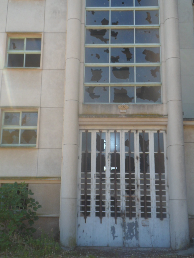
| the most pointless door |
 |
| HAPPY BIN |
 |
| not me! casually drawn on a used metro newspaper in my carriage |

 |
| thats a naked barbie doll in a piss soaked doorway. |
 |
| found in a toilet cubicle |
 |
| love this van. wonder what it delivers and for whom? |
 |
| never knew there was such a thing found in wandsworth |
 |
| i know it hasnt rotated but turn your head its poetry |

 |
| gig in an abandoned swimming pool |
 |
| yin / yang |
 |
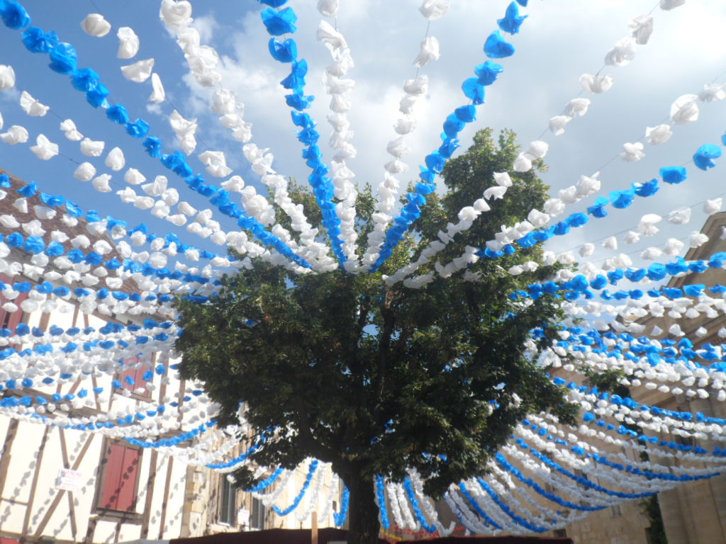
| picnic |


 |
| this town is massive and so incredibly varied. Nothing quite like it there is always something new to be seen or found [view from crystal palace] |