 |
| look at the panda |


 |
| these are just giving me some more cool ideas for my zombie style posters I like these mostly for the story they tell, thyre quite weird in a positive way, you can see theres some kind of mad story behind them and i like that the colours a pretty cool too! |


 |
| I noticed this year when I visited this massive assault of art prints in islington that I was paying a lot more attention to how galleries displayed their work. My personal favourite, the above image, was where one gallery instead of being a nice white walled box amoungst 250 other white walled boxes got out of it and displayed 4 or 5 instillations accross the building itself. I thought that was really innovative way of displaying the work. But they handed me a really boring A4 black and white piece of paper covered in times new roman, blandly set, explaining the pieces and the gallery. it was incredibly boring and binned it at the first opportunity as did many others I noticed. Again with the innovation is the below images, of one gallery section, i thought it was quite novel the way they sold their work packaging it and displaying it in this way as if some kind of art supermarket quite funny as well i thought! but it had the effect of making accessible and affordable and almost recognisable and I liked that. Im sure there are plenty of bespoke purists who where utterly aghast at this sight which makes me like it even more. |


 |
| deep fried bible. litrally |
 |
| this was all cut out, as if a stencil each letter individualy painted, cut out, stuck on. bloody hell! |

 |
| I now want to give my dog dreadlocks. |
 |
| this sculpture looks like michael winner |


 |
| I almost cringe at mentioning the word street art but i do love it, i feel as if alot of people internally groan at the word as its used so much and used so much artificially but this guy 'Jef Aerosoul' made some great pieces and it was refreshing to see an individual use of stencils It made me re consider them I also appreciate the collage to give texture, i tried to achieve the same with old yellowing sci fi comics and letterpress but when painted over i just lost all the quality |


 |
| robot spaniel! |
 |
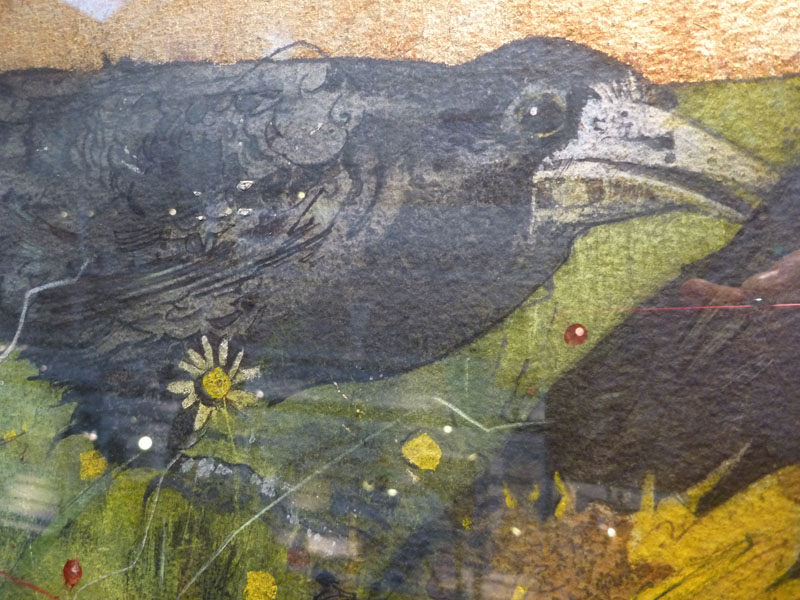
| Being good at drawing still counts sometimes you never get good only a little bit better than last year, must keep practicing |


 |
| i thought this was good! combining colour mag photos into a collage painting good use! |

 |
| stupid but i love it makes me smile, im getting into this daft style alot |


