In this workshop we were introduced to the different elements of letters/fonts/typefaces and their applications. Looking at how a font is more relevant for conveying particular messages etc. also looking at details such as the differences and what is ligatures serifs etc. i quite enjoyed learning that bit....
as you can see in these images i went about visually exploring the differences in various fonts by focusing in on different elements such as the ligatures, serifs.
i ran out of time before finishing the above image but i didnt like it anyway


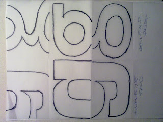
We started exploring type by being given a choice of 5 or 6 different fonts and to trace out our name.
-Now this exersize on its own i actually quite enjoyed and opened up a lot of ideas; im a bit crap with computer programs and my mind can work things a lot easier when doing stuff hands on, even if it does take a bit longer. [jo's computer workshops have since improved this, particuly manipulating type in illustrator-more on that another time]
-i really like the quality given, particuly here; it being done in pencil and the fact i didnt get time to finish it completely. brilliant n visually interesting in my opinion
Overall i enjoyed this workshop, i see type as a serious fundamental of graphics and i look forward to getting my hands dirty with more knowledge on this subject.
No comments:
Post a Comment